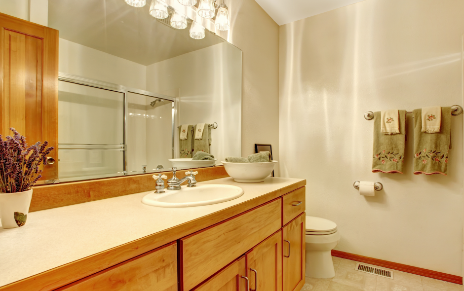
Are These Outdated Bathroom Design Elements Sabotaging Your Style?

While our grandmas may know a thing or two about cooking, their interior design skills typically leave a bit to be desired. If you’ve ever stepped foot into a doily-covered bathroom, you know exactly what we’re talking about. Between the heavy window treatments, fancy soaps, and frilly toilet seat covers, it’s easy to spot the woefully outdated décor. However, it’s more difficult to identify outdated design elements in homes built in the 80s or 90s, especially after you’ve been living in it for a while. With that in mind, we’re sharing a few key design elements that are keeping your bathroom rooted in the past, so you can finally welcome your bathroom into the twenty-first century.
Bulky Built-In Bathtubs: Now, bathers aren’t going to like this one, but it has to be stated, nonetheless — your built-in bathtub is making your bathroom feel way more dated than you think. With built-in edges perfectly suited for your faux plant collection, there’s simply no way to effectively incorporate a built-in bathtub into a modern design. Admittedly, the built-in jacuzzi feature is difficult to let go of, but these chunky tubs are literally and figuratively weighing down your bathroom. So, go ahead and take a few more soaks and then head to the store to find a more modern option. We promise you’ll be able to find one that feels just as comfortable. There are even stand-alone jacuzzi tubs out there and (more cost-effective) massage mats, so all you jacuzzi enthusiasts have no excuse for not embracing the modern era.
Doily-Inspired Window Treatments: While this outdated design element may come as no surprise, window treatments can be surprisingly easy to overlook. Whether you have white frilly curtains or a patterned valence, they’re both giving grandma vibes, and we certainly don’t want that. Removing your existing window treatments and installing light-filtering privacy film, is the most cost-effective solution. However, this option does prevent you from seeing outside. If that’s a deal-breaker for you, opt for a more streamlined option like a light-filtering roller shade — and do your best to avoid valences and shutters, which can make your bathroom feel dark and heavy.
Yellow Tones: Another design choice that may be secretly dating your bathroom, is the paint color. While once popular, yellows and beiges with yellow undertones are holding your bathroom back from being the modern spa oasis of your dreams. Luckily, paint is one of the easiest and most affordable changes you can make. For those who want to keep it light and bright, lean into trending colors like dusty greens, blues, and pinks. Those willing to take on a bolder look should embrace deep midnight blues or dark earthy sage tones. Regardless of which style you choose, a fresh coat of paint can be the difference between a stylish transitional design and an outdated bathroom, so grab your brushes and get painting!
Glass Block Accent Walls: Nothing screams 80s quite like a glass block accent wall. While the combined light-filtering and privacy-blocking characteristics work in theory, in reality, they don’t do either particularly well. And, since they’re literal glass blocks stacked together, they take up way too much real estate to not be useful. Unfortunately, demolishing these accent walls can be tedious and messy, which is why many homeowners begrudgingly leave them in place. The good news is, if you’ve held onto your glass wall this long, the style is starting to come back around. Interior designers are bringing glass block accents into the twenty-first century by incorporating black-painted frames, matte finishes, and warm tones. So, with a little DIYing, there might be hope for these 80s relics after all!
Fluorescent Lighting: Last but not least, we have one of the most common design oversights, fluorescent lighting. Although it may be an afterthought to you, bright fluorescent lighting screams clinical and can be visually overwhelming for those with sensitive eyes. The easiest way to rectify this is to simply swap out the light bulbs with a warmer tone or install a dimmer switch. But, if you have the budget, replacing your builder-grade light fixtures will take your design even further — the choice is ultimately up to you.
While many of these design elements could be easily identified by a houseguest (or potential buyer), after years of living in our homes we just get used to the way things are. So, if you’re guilty of becoming a bit blind to the design faux pas in your home, grab this list and take a look around — you might be surprised how many lingering 80s and 90s relics you have hiding in plain sight!

 Canada